Guidelines are not meant to be a straight-jacket, but a spring-board to launch the brand and properly use its elements.
Guide your clients through the document, don’t just tell them, so they can learn and so they know you care. Imagine doing it for yourself. Leaving bits open for interpretation will cause confusion on the client’s side, so be as comprehensive as possible.
Clear space around the logo
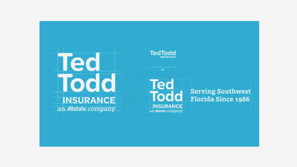
Logo in all sizes
Try logo in large, medium and small sizes. Adjust logo appearance when minimalized.

Inverse Brand

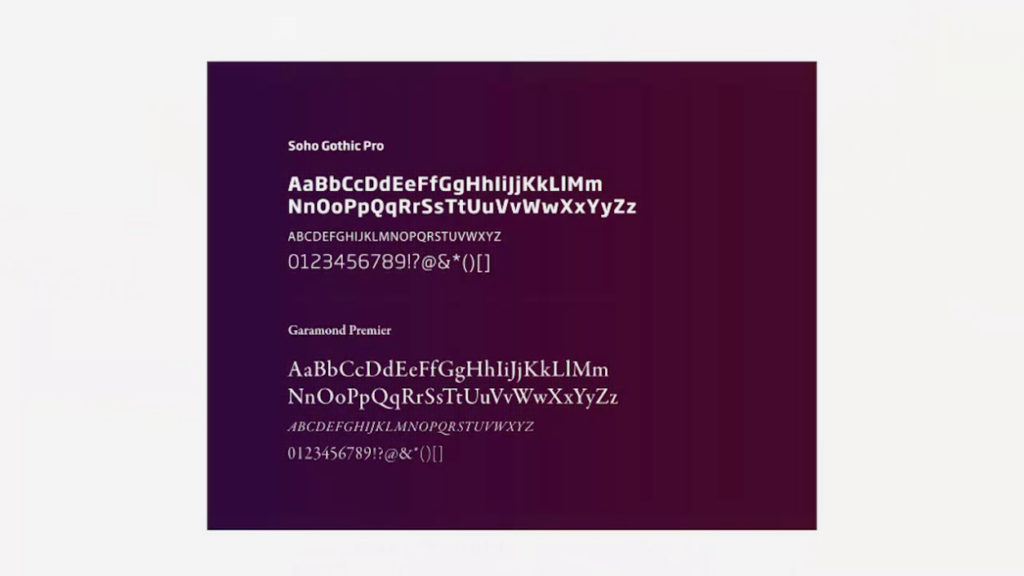
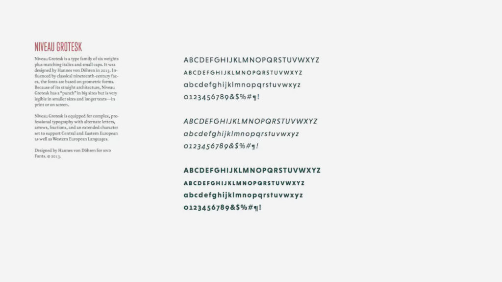
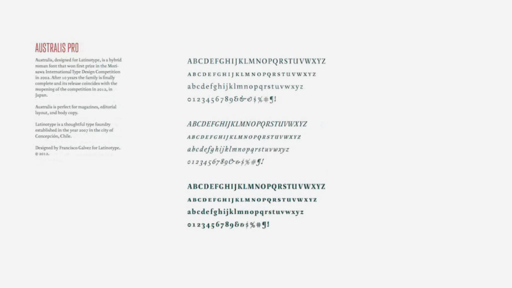
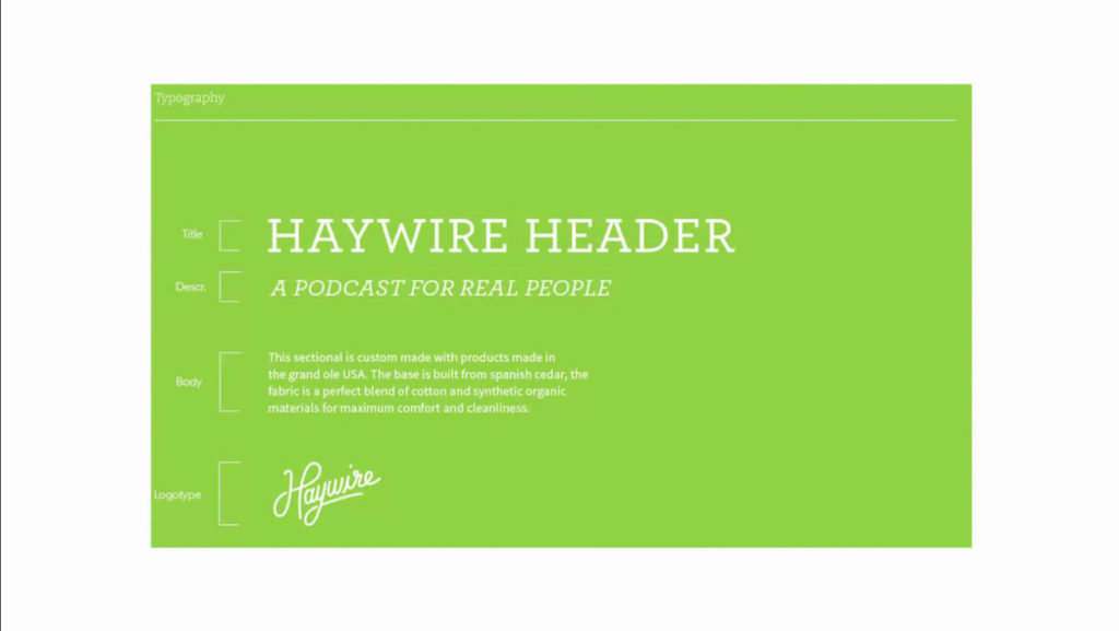
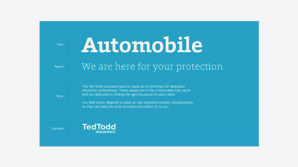
Typography and font info
How and where to use all the chosen fonts for the brand (show them in context)
Create some concept designs


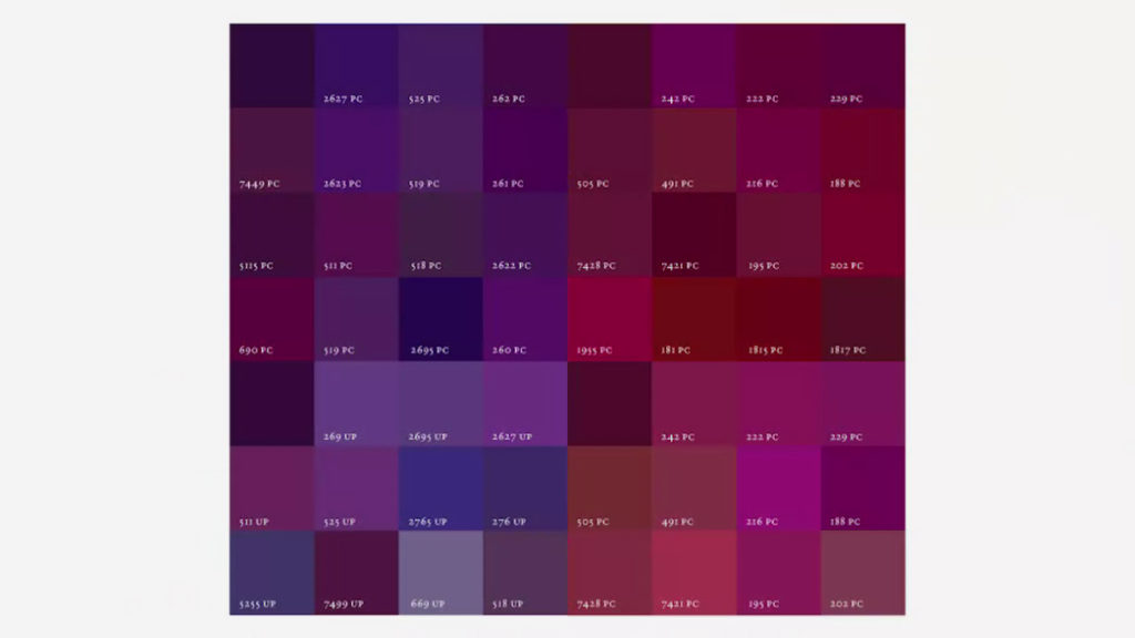
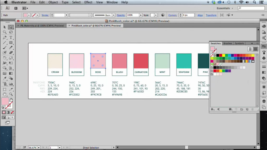
Named color palette
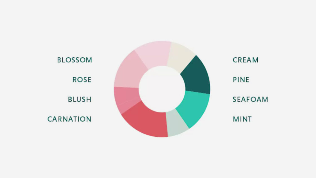
Color Profile (Hex, RGB, CMYK, Pantone)
Mention that RGB doesn’t print well.
Also mention that CMYK may look different on screen than on paper.

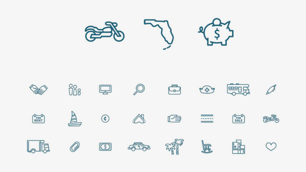
Secondary Visual Elements
Icons, Patterns, Photographic styles, etc. (show them in context i.e. in real examples)