Know the Content
Before you begin styling anything, it’s smart to familiarize yourself with the site’s content to get an overall big picture of everything involved.
Test On Paper
It’s often helpful to print out the page unstyled, and then go about hierarchically numbering content elements star
ting with one, what’s of most importance. Two, what’s of next importance, and so forth until every piece of content has been labelled. You can even make note of what HTML elements would be appropriate for each number like H1 or H2 or P.

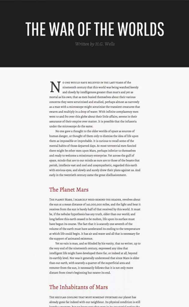
Styling By Importance
-
Weight
Do not use light weights at small sizes or for body text.
It can dramatically hinder legibility and readability. -
Size
-
Position
-
Caps
- Uppercase – Using all caps for your body text greatly decreases legibility and hierarchy.
- Small Caps – They are capital letters near the x-height of the typeface, and are evenly weighted and spaced with the rest of the overall typeface
-
Color
When utilizing color, contrast plays a key role in hierarchy.
-
Pair Typefaces
- with similar proportions.
- with complementary personalities.
- from the same historical period.
- from the same designer.
Remember to not make typographic choices just because. Have a reason behind why you’re bolding or italicizing text and why you’re increasing sizes. Or why you’re moving an element to a certain place.
Don’t overdo it, if all elements are important then nothing is important.
