
Type Resizing
On smaller screens, body text should be a bit smaller than its original size. Also headings can often get too large on small screen sizes, so their font-size and line-height need adjusting.
Use several @media queries dedicated particularly for font properties to enhance the legibility of text utilizing the two-asterisks measurement techniques. They should be used for responsive typography to gauge where to make breakpoints and adjust.
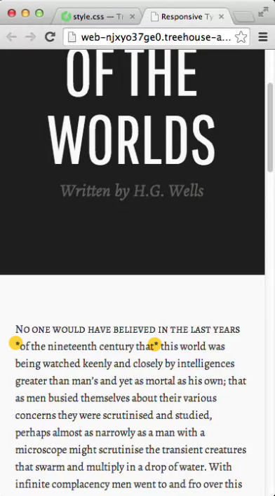
Viewport Width
The unit measure vw that will we be able to utilize to change the font-size based on the browser width. Type shrinks as the browser width changes. Also check the vertical height vh.
h1 {
  font-size: 10vw;
}
